Killat x Bluebird
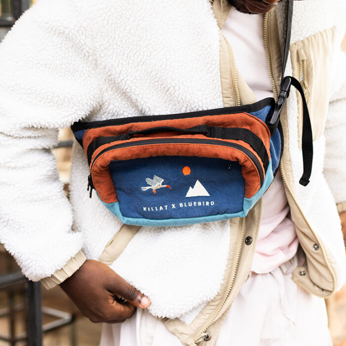
Happy to have been able to facilitate and design this collaboration between my friends at Killat and Bluebird.
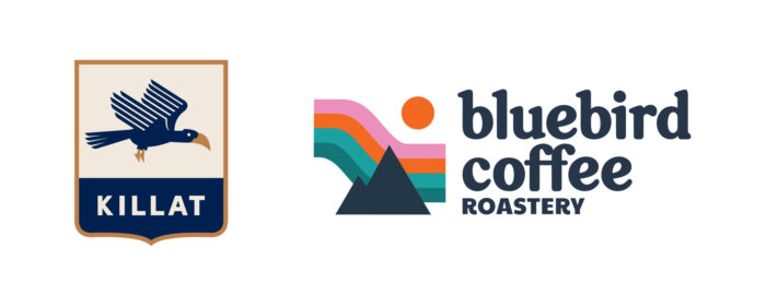
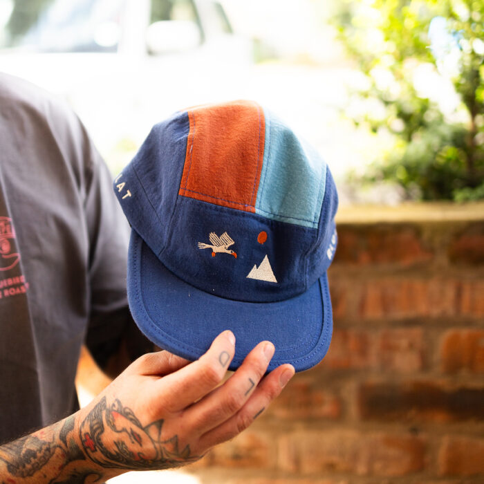
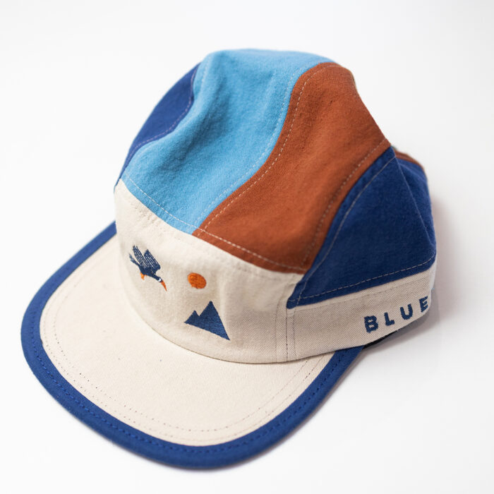
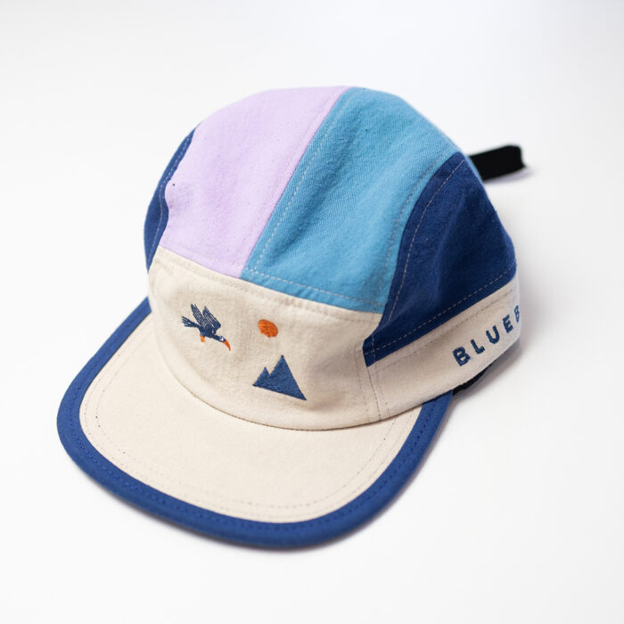
I looked at both brands’ logos (honoured to have created Killat’s logo) and thought that they seemed quite cohesive, both icon and colour-wise, which gave me the idea to combine them into one image i.e. the hornbill flying over a landscape.
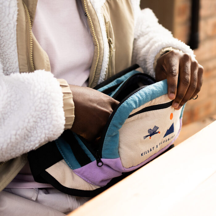
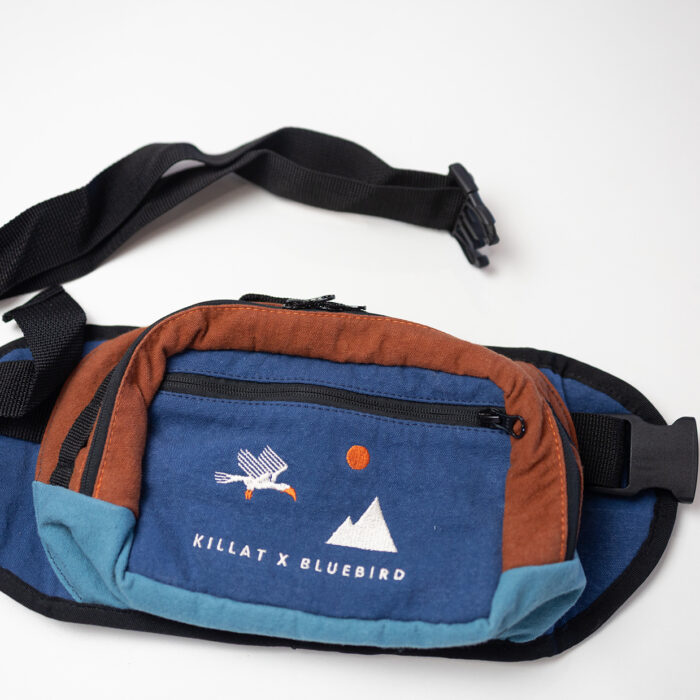
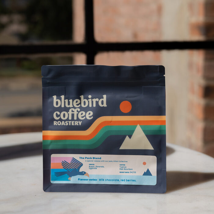
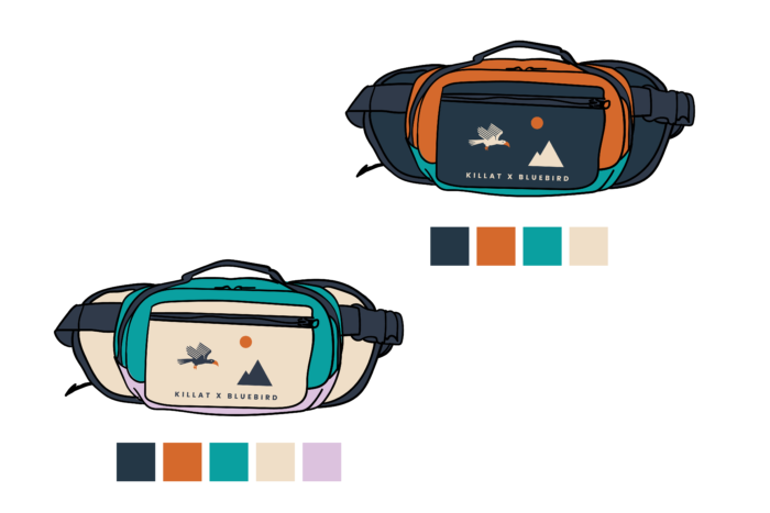
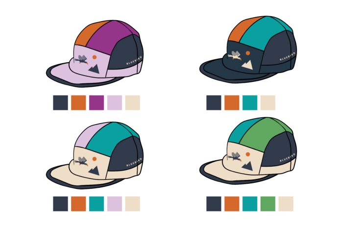
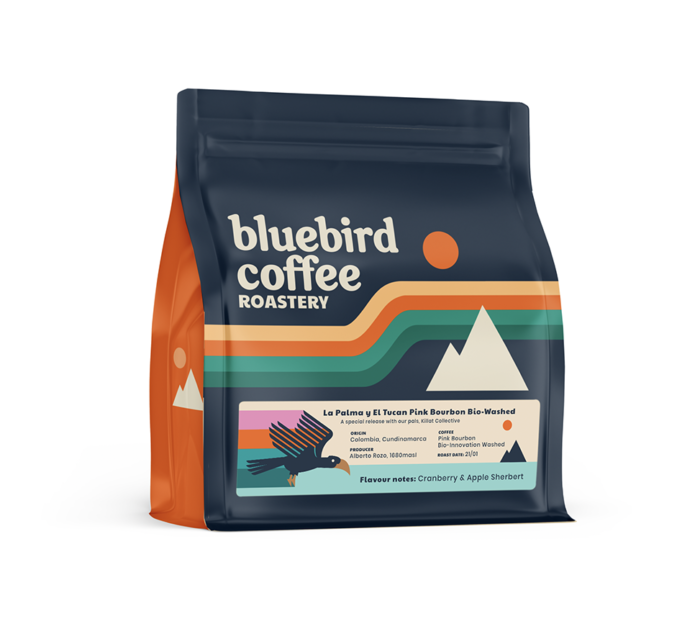
The idea was to release both a coffee through Bluebird and caps and moon bags through Killat. I took inspiration from Bluebird’s coffee bags to select the colours for the panels of the caps and bags, which I think made the collaboration even more cohesive.
As a team we did a lot of brainstorming on the bags, but these were the ones we collectively ended up deciding on. I created some vector mockups of the bags and caps:
The coffee bag label concept that was decided on:
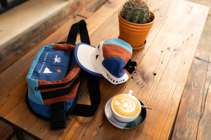
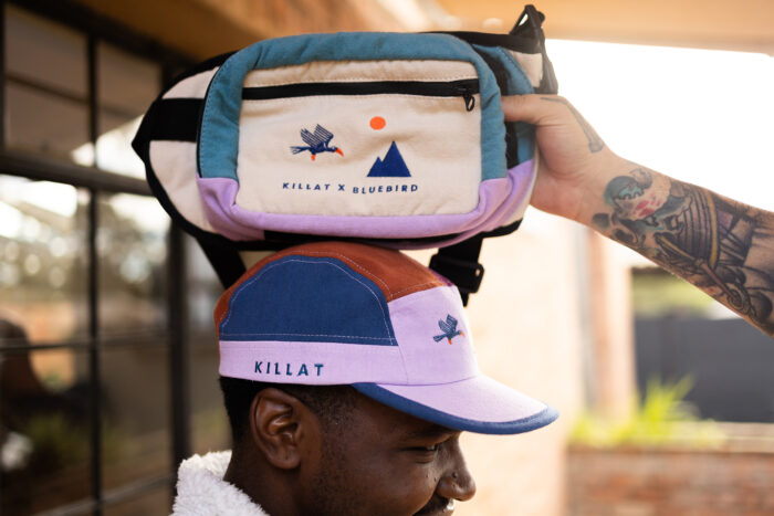
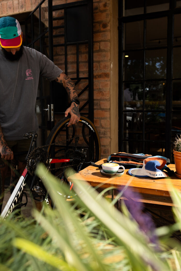
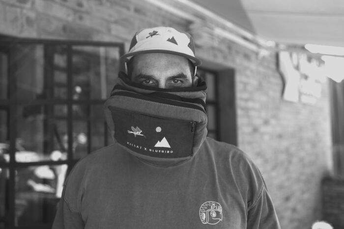
Killat did such a great job on the caps and bags and it was super fun to do this shoot at Bluebird’s coffee roastery. Katie did an amazing job with the photography, Dario was an awesome director, and Luhle made the product look even better.